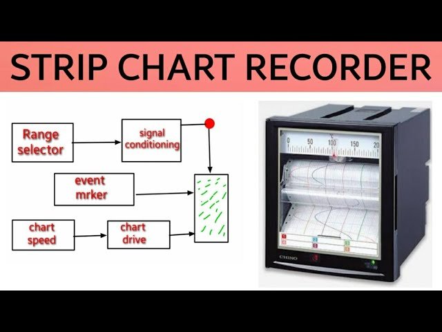
Introduction:
A strip chart is a versatile data visualization tool to analyze trends, patterns and outliers in your data. It uses individual data points to show values, so you can see variability over time or categories. Unlike line graphs or bar charts, strip charts show raw data not aggregated values. Simple and effective they are used in industries like research, business and healthcare.These are great for time-series data where every point matters. By showing anomalies and fluctuations strip charts help decision makers see insights that may be hidden in aggregated charts. Whether you’re tracking daily stock prices, patient health metrics or regional sales data a well designed strip chart will bring clarity and accuracy to your analysis.
What is a Strip Chart?
A strip chart, also known as a strip plot, is a graph that shows individual data points on a continuous axis. It’s a simple way to visualise time series data, categorical data or trends so you can spot patterns and anomalies at a glance.
Unlike bar charts or scatter plots, strip charts show individual data points without aggregation. This makes them perfect for datasets where every value counts.
Strip Chart Features
The Strip charts have these key characteristics:
- Clarity: Each data point is visible.
- Customisation: You can highlight specific patterns or categories.
- Time-Focused: Good for continuous data, like time series analysis.
- Easy to use: Minimal preprocessing and works with many data types.
Strip Chart Use Cases
The Strip charts are great for any field where data trends are important:
- Scientific Research: Visualise experimental results or monitor data changes.
- Healthcare Analytics: Track patient metrics like heart rates over time.
- Business Monitoring: Monitor sales trends or operational performance.
- Environmental Studies: Monitor temperature, rainfall or pollutant levels.
Types of Strip Charts
1. Continuous Strip Charts
These charts show data points plotted against time. For example, continuous monitoring of electricity usage over a day shows the fluctuations hour by hour.
2. Categorical Strip Charts
This type shows data grouped into categories. For example, sales figures from different regions can be plotted on the same axis for comparison.
3. Overlapping Strip Charts
Multiple datasets on the same axis so you can see relationships or overlaps. Common in multi-sample experiments.
4. Interactive Strip Charts
Modern tools have interactive features like zooming or hovering to show more data.
How to Make a Strip Chart
Making a strip chart involves several steps, pay attention to each one for good data storytelling:
1. Gather and Clean Data
Get your data in order by making sure it’s complete, accurate and formatted for visualization. For example, columns might be timestamps and measurements.
2. Choose the Right Tool
There are many tools to make strip charts, from Microsoft Excel to more advanced ones like Python’s Matplotlib or R’s ggplot2. Pick one that matches your technical skills and project needs.
3. Set up Axes and Scale
Set up the x-axis and y-axis. For example, the x-axis might be time and the y-axis the values.
4. Plot the Data Points
Plot the data points onto the chart. Make sure there’s enough space between points for the intervals in your data.
5. Customize for Readability
Tweak markers, colors and labels so your chart is both informative and pretty.
Strip Chart Benefits
1. Data Point Precision
Strip charts allow you to focus on individual data points, no generalization.
2. Outliers
All points are shown, so anomalies stand out. Great for spotting errors or big deviations.
3. Ease of Interpretation
Unlike complex visualizations, strip charts are simple, so everyone can understand.
Problems and Limitations
1. Too Many Data Points
For big datasets, points can overlap. Solutions are jittering (adding a tiny offset) or interactive elements.
2. No Context
Strip charts are great for raw data but lack context. Use other visualizations to complete the picture.
3. Axis Dependence
Bad scaling or axis choice can mess up the interpretation. Make sure to set axis ranges correctly.
Strip Charts with Technology
Adding technology to strip charts:
1. Dynamic Dashboards
Tableau lets you update strip charts in real time.
2. Augmented Analytics
AI will find trends or anomalies in strip charts for you.
3. Multi-Dimensional Visualizations
Combine strip charts with other graphs on a dashboard for more insight.
Strip Chart Best Practices
- Choose Good Markers: Use different symbols for different datasets.
- Don’t Overplot: Space points or use transparency to avoid clutter.
- Add Context: Include key events or thresholds.
- Test for Audience: Make sure your chart works for your audience.
Strip Chart in Action
Here’s an example of a strip chart tracking daily stock prices of a company. The x-axis is time (days), the y-axis is price. Over time, spikes and dips become apparent and analysts can predict trends and make decisions.
Conclusion
The strip chart is a simple but effective visualization that shows individual data points and trends. It’s good for any industry, science to business. Follow best practices and use modern tools and you can create strip charts that inform and act.
Also Read:SDMX PX IndianOil Edealer_ENU: Streamlining Dealer Operations
FAQs
What is a strip chart used for?
A strip chart is used to show data trends over time or across categories, to see individual data points.
How is a strip chart different from a line graph?
A line graph connects the data points to show trends, a strip chart shows individual points without connections to show discrete values.
What tools can I use to create a strip chart?
Microsoft Excel, Python (Matplotlib or Seaborn), R (ggplot2) are popular options.
How do I handle overlapping points in a strip chart?
Jittering or transparency can help separate overlapping points.
Can strip charts show categorical data?
Yes, strip charts can group data by category on one axis for comparison.
What to avoid when creating a strip chart?
Poor axis scaling, too many data points, not enough labeling.


